Subscribe to:
Post Comments (Atom)
skip to main |
skip to sidebar


TWITCH
Twitter
LinkedIn
Deviant Art
Instagram
Artstation
Shop
-ABOUT ROXY-
I am, Roxy, a comic artist, character designer, video game and animation concept artist, storyboarder, writer and editor. I am currently available for freelance work, so drop me a line if you wanna create something great together!
roxypolk(@)gmail(.)com
ROXY'S ART


TWITCH
Deviant Art
Artstation
Shop
-ABOUT ROXY-
I am, Roxy, a comic artist, character designer, video game and animation concept artist, storyboarder, writer and editor. I am currently available for freelance work, so drop me a line if you wanna create something great together!
roxypolk(@)gmail(.)com


7 comments:
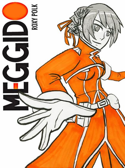
i think simple is always better, and honestly more attractive~ I tend to be drawn to books with better cover design rather than the ones crowded with tons of characters and stuff. Plus color themed always tends to stay more organized :) I dont know why... something about color coding that I love...
otherwise I really like the pose and the composition of the cover. Is this a final draft or a revision of an earlier draft? lol
Either way I think if you stick to that idea it might also be easier on you cause then youre not trying to figure out what kind of illustration to put on each issue/book and its nice and simple yet attractive way to communicate the spirit of the story.
just my thoughts :)
Agreed, especially if this really flattens out with really crisp lineart. It's a bold, simple design that really catches the eye. :3 The composition is really awesome!
I like your logo, but I don't know how I feel about the gradients in it. Just the regular orange would be enough! I don't know what your plans are for that, if the logo were to change colour with each character (I think it should).. but yes.
That's just my two-cents, as it were. Overall it's a very smart design! :D
I think plain is always good. you should use rainbow colors!!
Well, I suppose by now it's apparent that your cover looks good lol I do like the pose =P maybe if you put a border on it... it looked a little empty imo...heh, sorry about editing it w/o asking first =/
(http://i83.photobucket.com/albums/
j314/the_task_master/MEGGIDO.png)
cool to see your name on a cover though, eh?
The single color cover is a good idea especially if you continue with the full body pose you're using on the 1st cover. I would keep a similar theme with the other books as well.
Good stuff!
Marc
MEGGIDO... That's right M-E-G-G-I-D-O. :) This is simple... simle-ly PERFECT!
Post a Comment